A-List Power washing
A-List Power washing needed a new look, before reaching out to me the owner of this company just simply typed out his company name the same way in the same font and used that for his logo. He sought out some branding guidance and this is the process we took together to come up with his logo.
The brief
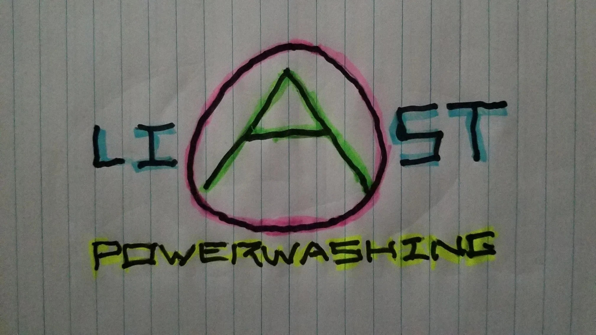
It all began from a simple drawing that the owner sent me, he wanted the “A“ to stand out in a circle. The problem with this design is it looked like the company name was LIAST and we were just circling the middle letter to be creative. So early on we knew this wasn't going to work and tried new ideas.
First Drafts
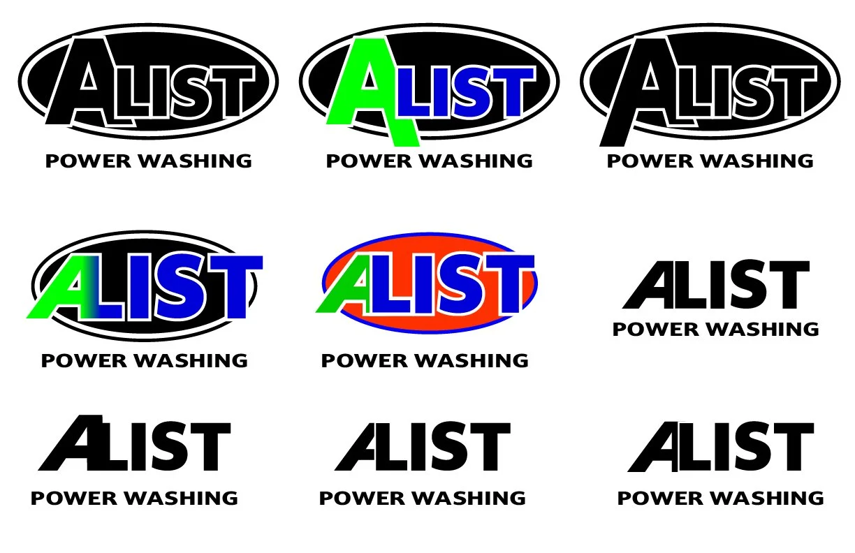
We got the first round of logos up and running, emphasizing a much bigger a on the left side of the logo to make sure it doesn't spell “LIAST“ like before.
Getting closer
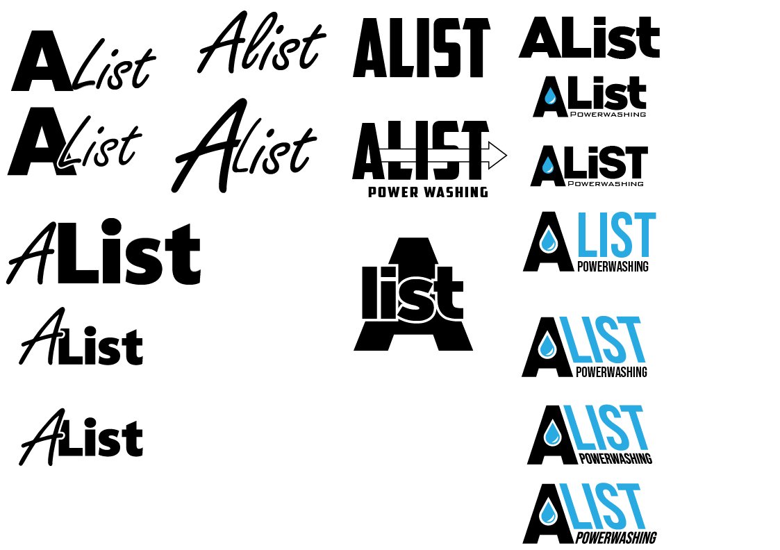
Other ideas were coming out of this, but the client realized we were veering off the path of his original image, so we took a step back from here even though some of these were my personal favorite.
Taking a step back
We brought back this circle a logo and tried to incorporate it the best we could. I mentioned having it all stacked on top of each other would avoid making the word say “LIAST“ so we stuck with the idea of stacking it on top of one another
The Final logo
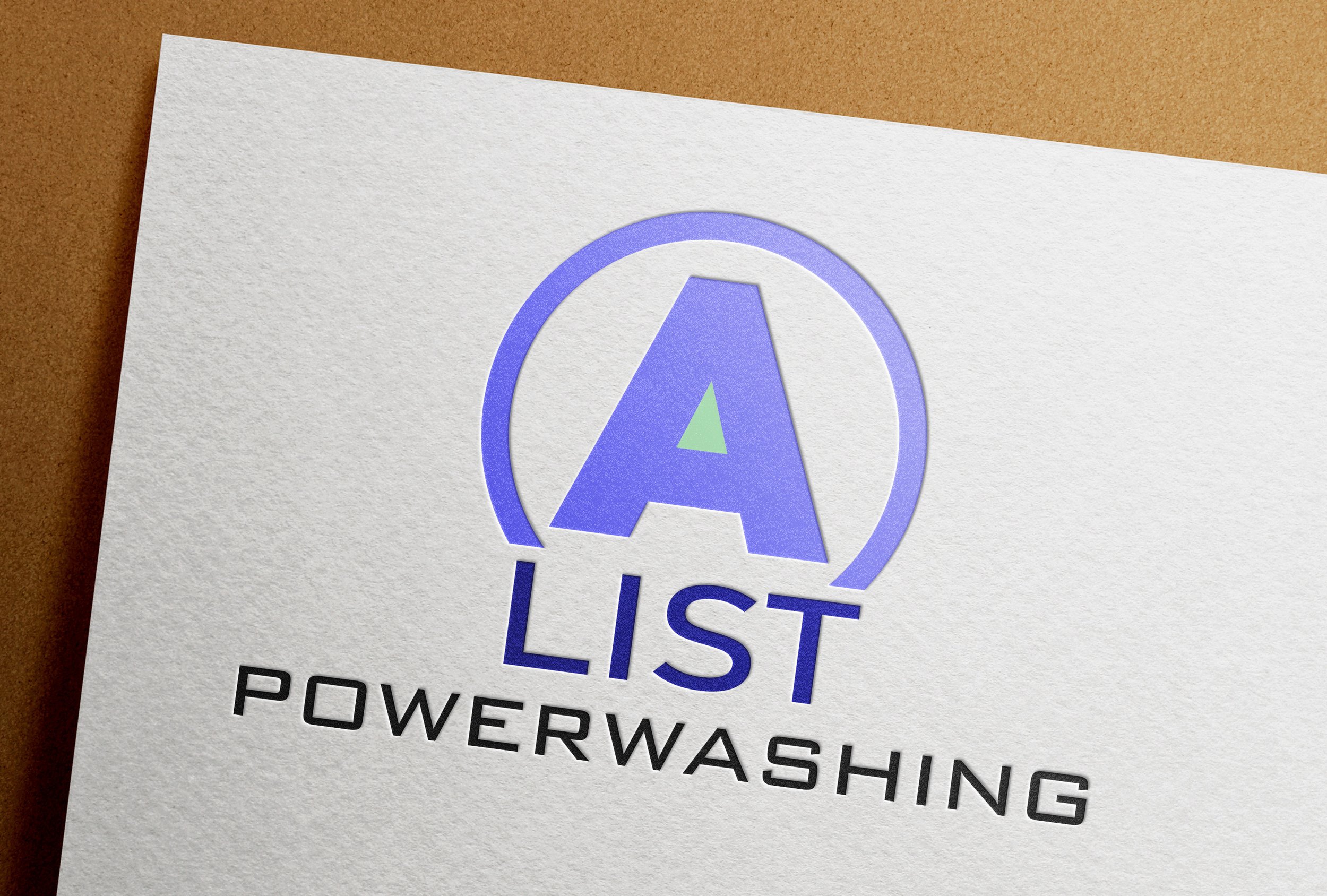
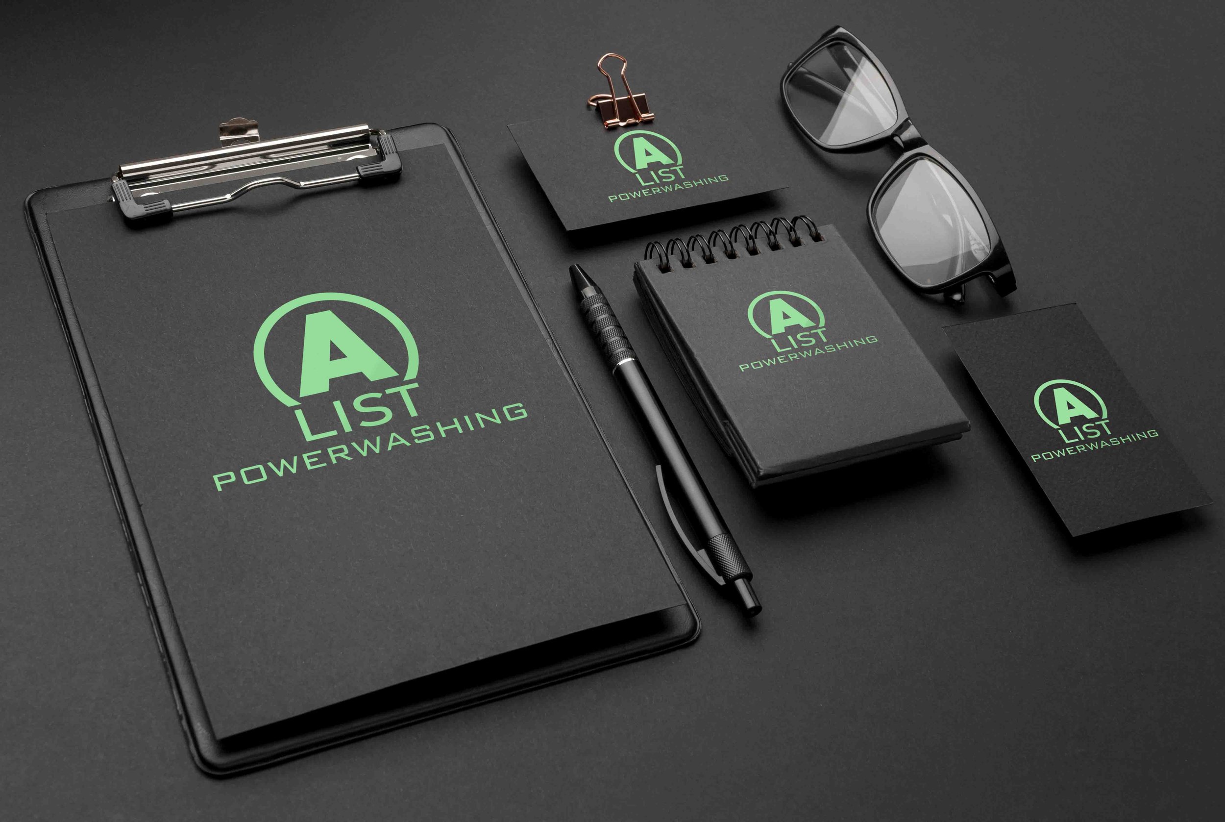
Eventually me and the client together came up with this concept. We had the “list” slightly interacting with the “A” not connecting but having an open bottom circle on the bottom of the A to make it all seem like it was fitting together and not standing too much by itself.
Making it responsive
-
Full concept
This variation can be used wherever the client deems necessary, and supplies all the necessary information to understand what the company is and the company name.
-

Slightly simplified
This concept just gives the name of the company and not necessarily what they do. This variation of the logo can be applied to an email profile picture or a social media profile picture or a workers shirt or a piece of equipment that is obviously power washing equipment and doesn't need explanation
-
Stand alone imagery
This variation is broken up into the most basic form with just the A, this variation can possibly be used as a icon in the background that isn't too necessary or needed to be seen, but used as something to fill space
